Mock Magazine Design: London Edition
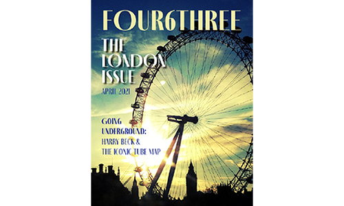
For my graphic design class, we created a mock magazine cover. The theme was centered around London and had London stories throughout. Therefore, I used an image of the London Eye with a silhouette of city buildings. I incorporated the colors from the picture into the text to create a cohesive design. Scroll down for the accompanying spreads.
Mock Magazine Spread: London Edition
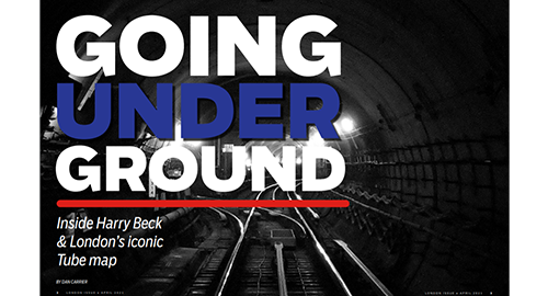
This is the first spread from the magazine seen above. The story was about London's iconic tube map so, I incorporated various design elements and colors from the London Underground in this opening page. The picture is an image of the underground tunnels and ties in with the story title of Going Underground.
Mock Magazine Spread: London Edition
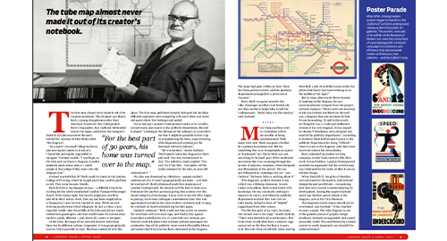
The next spread keeps the same colors to create a link between the two pages. The red line is also repeated from the first page on the folio. There is a picture with a quote as well as a pull-out quote within the story. A sidebar is included to the right to feature the various posters created by the London Underground over the years. I feel like the design of these two magazine spreads work well together and create a clear visual theme throughout.
Mock Magazine Cover: Lil Bub edition
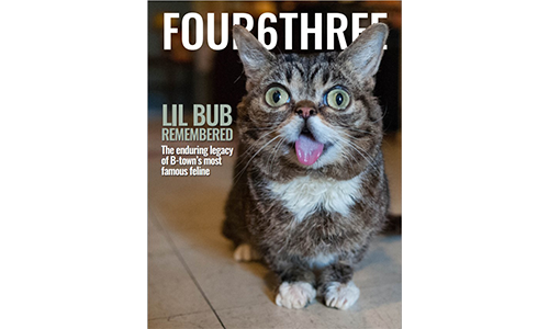
For the next mock magazine, the magazine theme remembers the impact famous cat Lil Bub had on the community. In order for the magzine name to appear behind the cats head, a cutout of Lil Bub's head was created and placed on top of the original image. The story headline color was pulled from the green eyes. I think it is a simple yet effective magazine cover with a distinct focus on the cat.
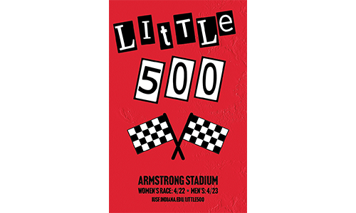
Little 500 Race Event Poster
The Little 500 is an annual bike race event held on the Indiana University Bloomington campus. The university's colors are red and white therefore I went with a red, white, and black theme. I drew influence from graphic designer Jamie Reid who created the Sex Pistols album covers. The letters are in a similar style to his letters on various works of art. I created the race flag in Adobe Illustrator and duplicated the flags to illustrate a common race symbol. Also, I added a texture to the background to increase the visual interest. The texture is derived from one of my pictures and texturized with Illustrator's filter gallery. In my opinion, I feel the design is a good mix of Jamie Reid and Indiana University influences.